

UX/UI, social content, brand identity, communications strategy
THE CHALLENGE
The Striders are a membership organization of health-minded Savannah residents who combine fitness, fun and friendship through group events in the community. They approached me with the ask to develop a promotional rack card and my thoughts on developing an app, but further exploration of the Club’s needs uncovered a need for a clearer branding and communications strategy to create a coherent, consistent and on-brand message.
THE APPROACH
After evaluating the brand and identifying its goals, it was clear the Striders had a solid brand but was having trouble communicating it to current members but especially potential new members. A new communication strategy was developed, including a new website architecture, streamlining and expanding social media communications, and identifying areas for visual updates to maintain a coherent visual system across all media.
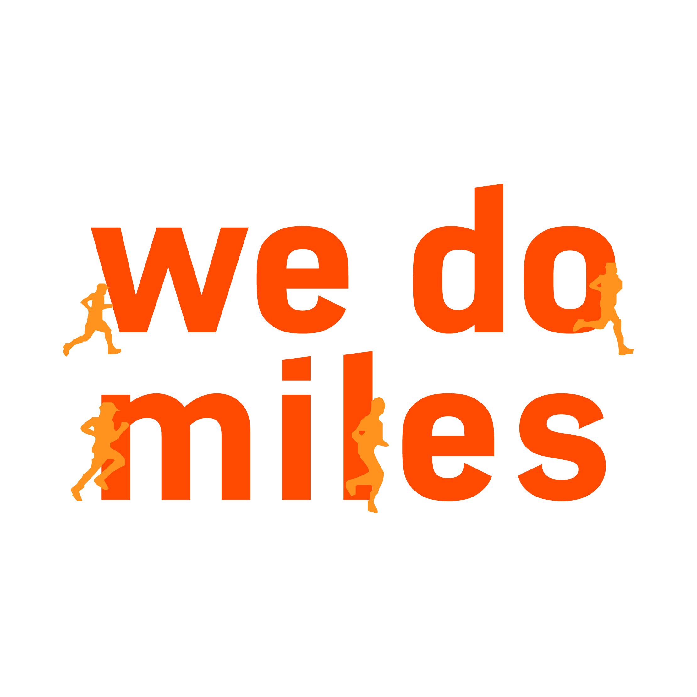
First, the existing visual identity was modified to reflect a brighter colour palette and a more readable typeface without losing its strong brand recognition amongst current and new members. The new communication strategy and brand guidelines have allowed the Striders to streamline their brand to become closer to achieving their ultimate mission: to become the #1 running club on the planet.
THE RESULTS
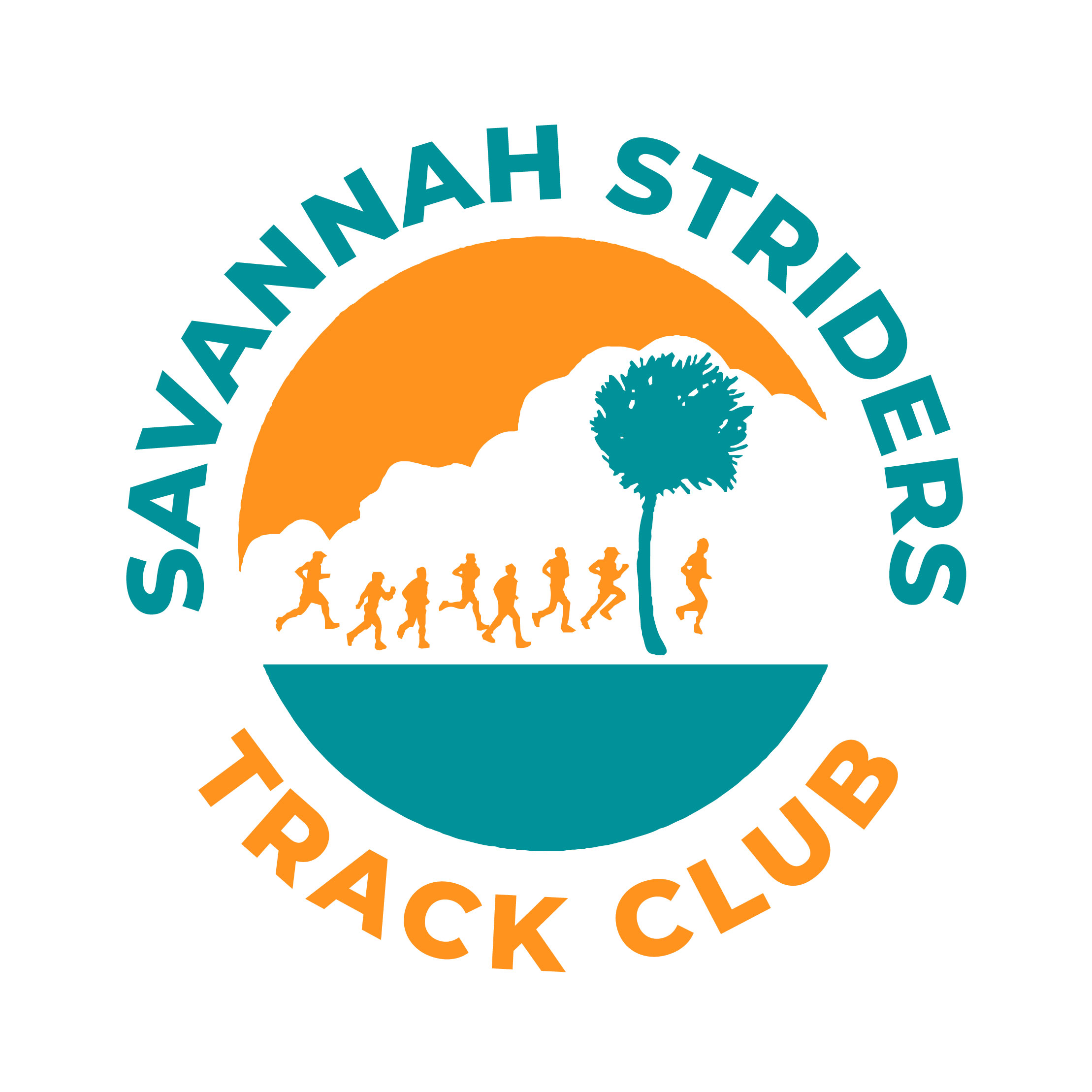
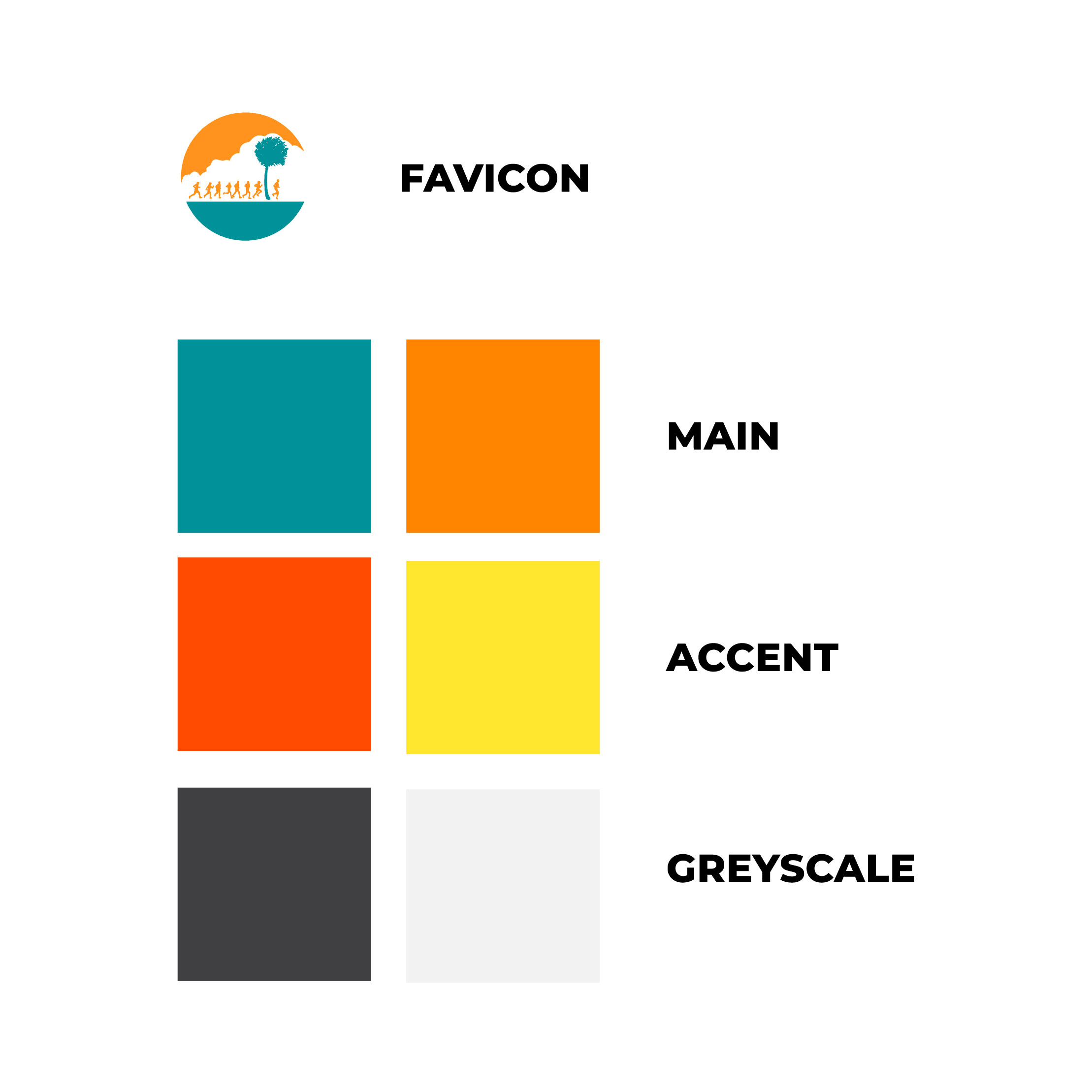
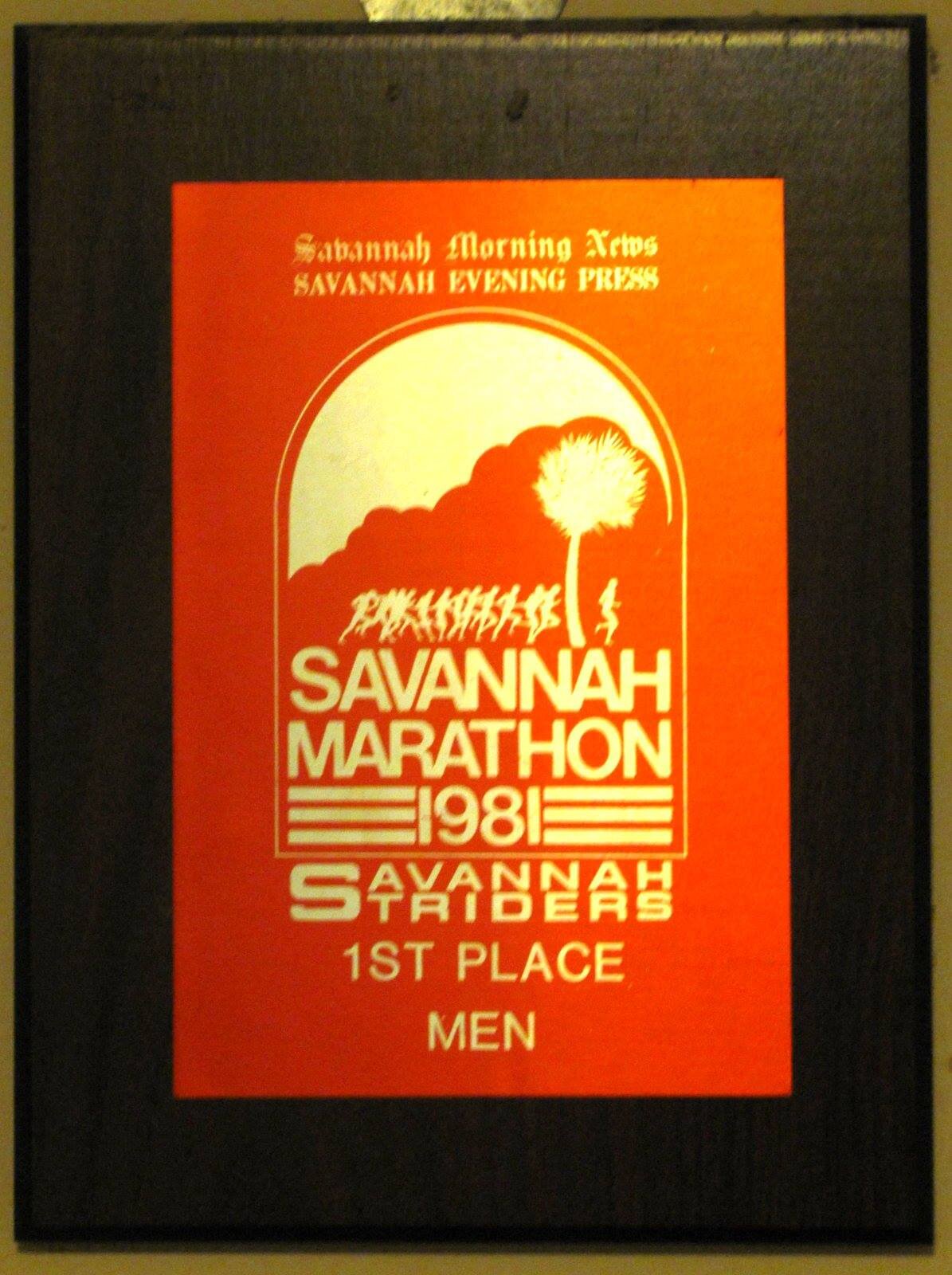
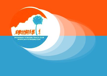
NEW LOGOS: The Striders’ 40-year anniversary called for a second look at their visual identity. The current logo was revised with a brighter colour palette, new typeface, and a secondary logo that would be used on web and printed letterheads as a more formal alternative to the circular crest but also paid tribute to the original logo from the 1970s and 1980s.


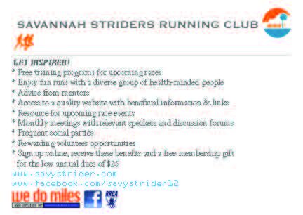

SOCIAL STRATEGY: One of the pillars of the Striders brand is social and friendship. Although the group is active on Facebook and sometimes sharing content on Instagram and in an email newsletter, there was little consistency in visuals. Existing images ranged from awkwardly candid photos before a group run to somewhat-relevant, pixelated icons. A simple photo and type treatment allows for any board member to celebrate members’ accomplishments, act as a cover image for an event’s photo album or remind members of upcoming events.
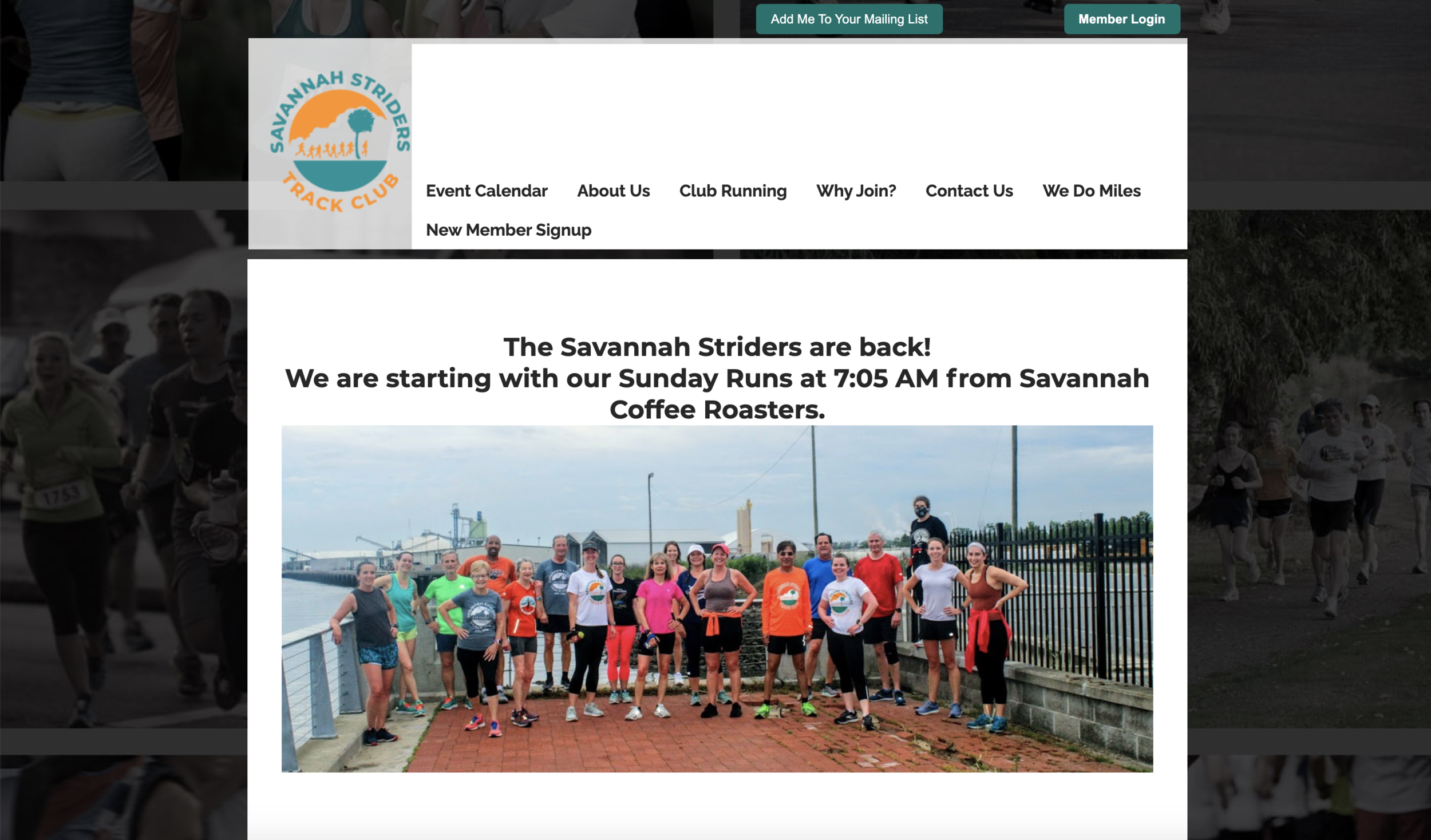
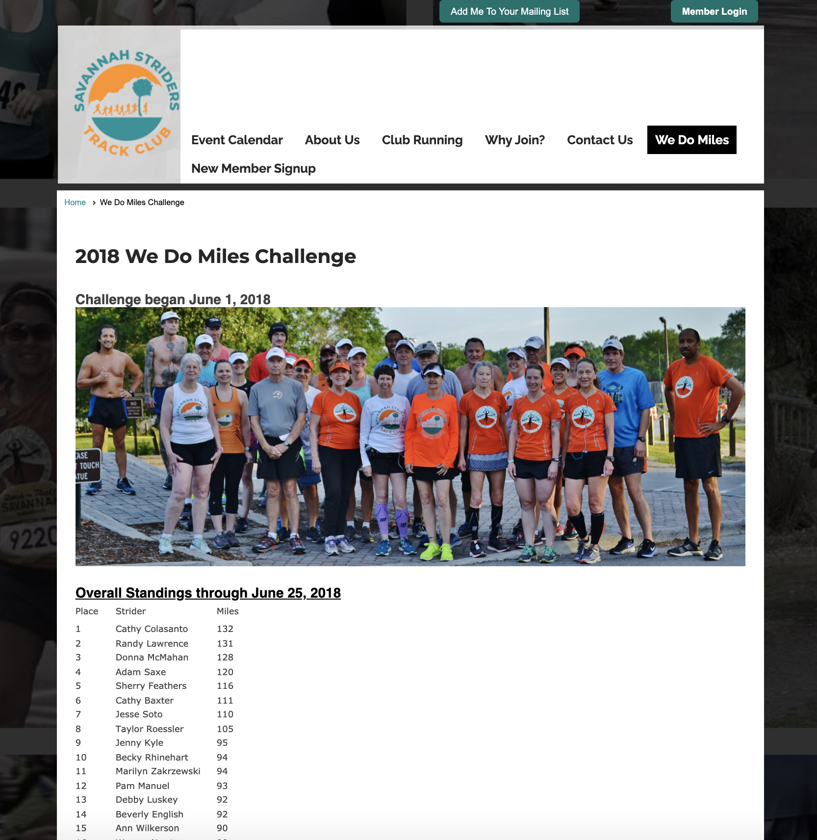
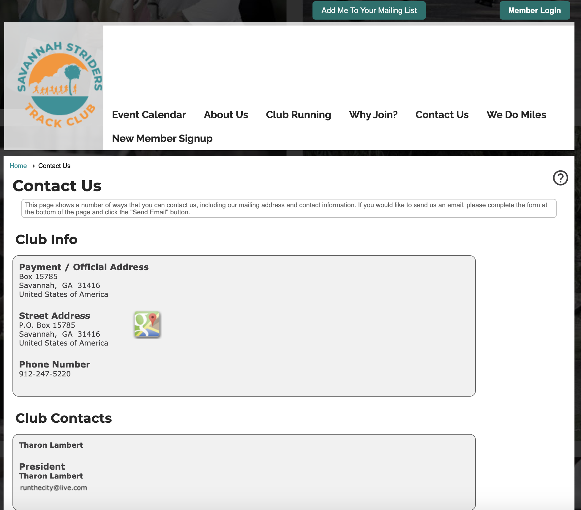
WEBSITE: The Striders’ website is the first resource visitors to Savannah and new members will look at for more information. The new website is clean with an easy-to-understand layout and menu options with all-new copy for each section.
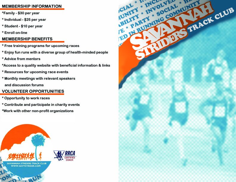
NEW MEMBER INFORMATION CARD: A Chamber of Commerce card was commissioned to help recruit new members and also offer an invitation to tourists passing through Savannah additional information on how to join the club for a run during their visit. Card design included copywriting, type and colour selection, layout recommendations, and custom map visuals for each running route.

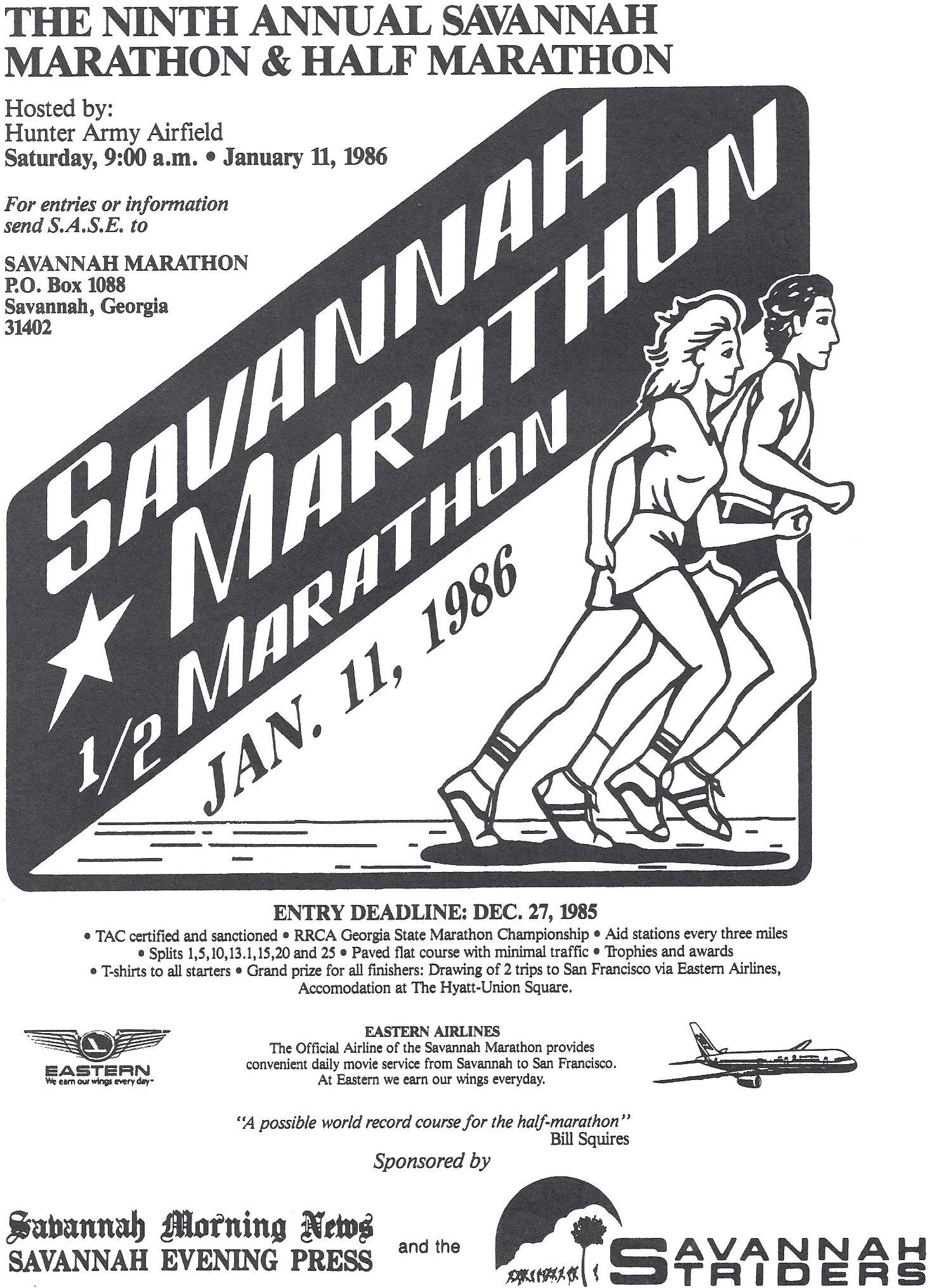
Information card to be included in Chamber of Commerce displays across Savannah to boost membership and attract tourists to join group runs when visiting. Info card was commissioned prior to a branding refresh.
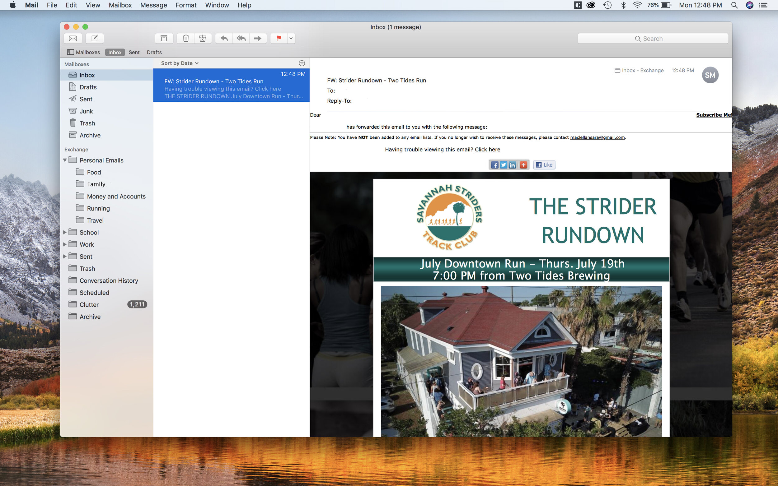
ONLINE NEWSLETTER: While the current monthly newsletter (aptly titled The Strider Rundown) offered updates and reminders to members, the email itself was often long and the content included in it wasn’t accessible as an archive on the existing website. The new template is consistent and easy to load on any device, while readers have the option to be redirected to the website to learn more information about certain categories.
Client: Savannah Striders Track Club